BRANDING & LOGO
YELLOW
#E8B926
ORANGE
#E48D0D
PINK
#DFB3B1
PURPLE
#380661
GREEN
#BBCEAA
LOGO FONT*
Sofia Pro
a b c d e f g h i j k l m
n o p q r s t u v w x y z
BODY FONT*
Montserrat
a b c d e f g h i j k l m
n o p q r s t u v w x y z

*This is a re-brand I did for the portfolio the remainder of this page has a slightly different logo and packaging design developed by another team member
PACKAGING PROCESS
01
Sustainability
02
User Interaction
03
Clarity
04
Usability
05
Impact
06
Durability

What we did
- Research
- Branding
- Prototypes
- Dye Line Design
- Printing and Assembly
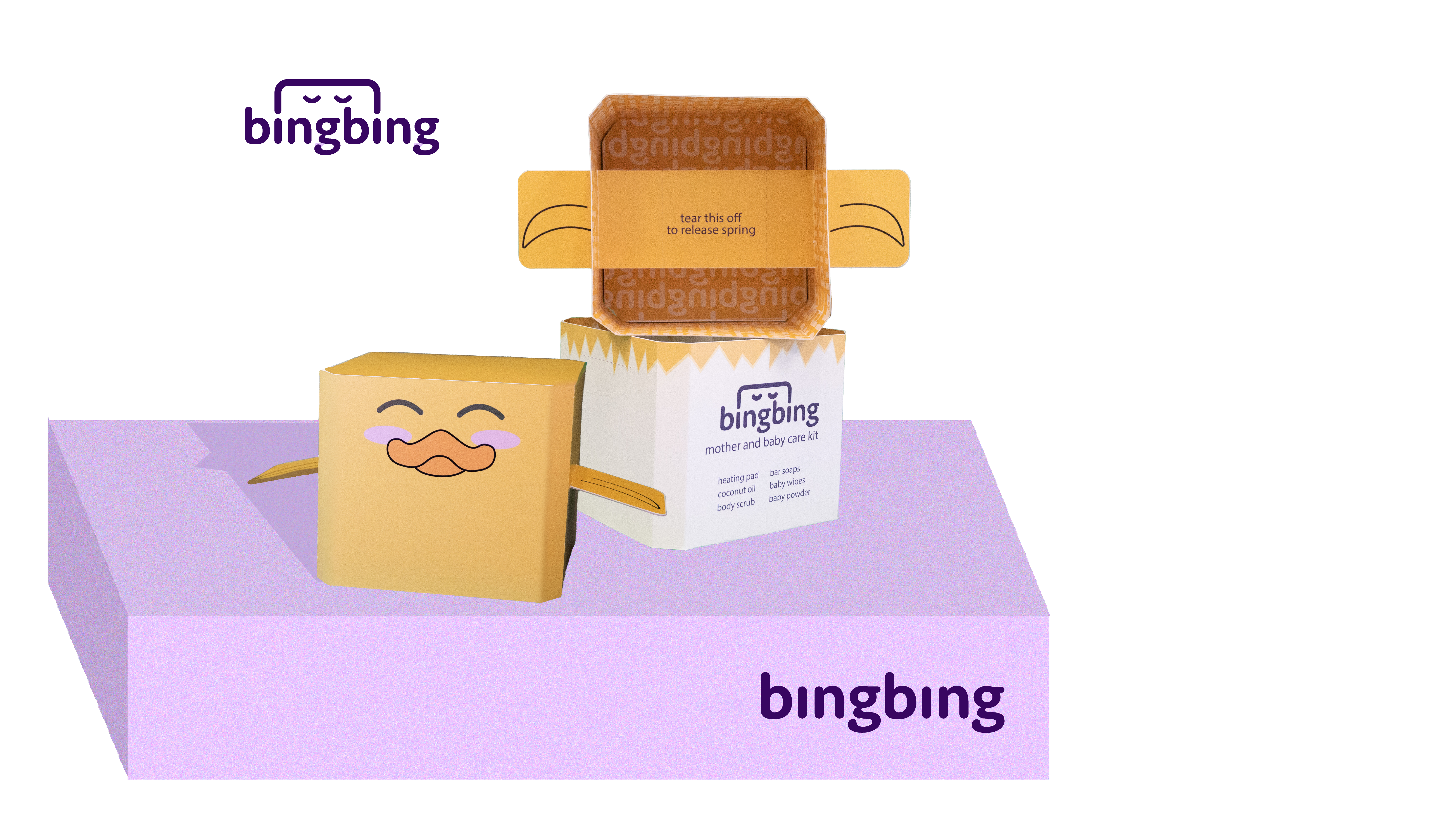
bingbing creates a full user experience for mothers through it's kit
As a company that fears the conditions of our land pollution and strives to reduce waste we have to have the most interesting packaging on the market!


PROTO 1


PROTO 2

Lid (flipped)

Front

Inside Lid
Bouncing
Starting with our 2" origami bingbing toy we brought it a long way. We not only added all out products but thought about certain details like cutting away at the corners to make our toy more baby safe. Getting the right sizes for the toy to work took lots of trial and error or lid sizes, base sizes and spring sizes.


9 TOTAL
PRODUCTS
Our products were a huge factor in our packaging dimensions. We payed special attention to the most effective way to place our products in the box.

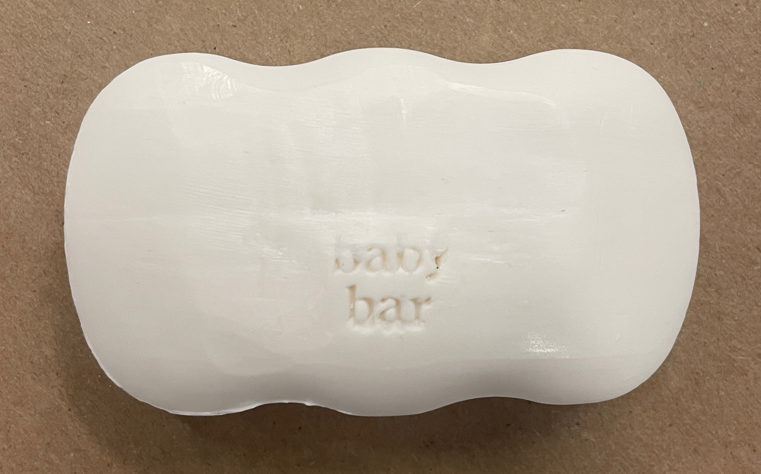
FUN FACT
We shaved our bar of soap with a wavy edge to match the playfull bingbing branding